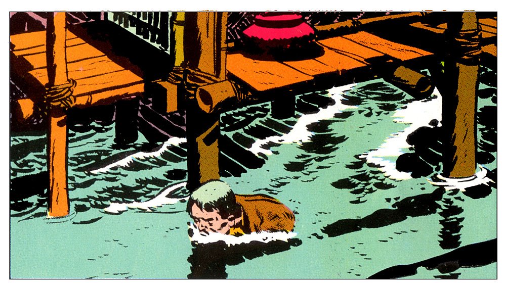
Wanted to start a Friday post series, and to talk about Frank Robbins - so off we go!
Along with Milton Caniff, Frank defined this style, both having worked with the incredible Noel Sickles, their style is refined (?) from early ink drawings of the master illustrator Harold Von Schmidt.
Robbins began his Johnny Hazard series at the end of WW2, and what a fun run it was!
Alex Toth loved (and hated) his work. There was a point at which Toth felt Robbins had lost something, and when exactly that might be is up to debate. Robbin's style in the 1970s differed vastly from his early work, but then, everyone's art evolves.
He was one of the masters of light and shadow, design and compostion. He placed large ink areas into the art with absolute confidence and grace.
Color on the strip was primitive as was a consequence of the time, technology and media, and yet, it works. A single image often held so much, but not in a cluttered way.
Many are the discussions on the difficulty of depicting water, and variety of style to do so. Robbins knew how.
Hazard was an adventure strip at its best, with all the feel of men's adventure and the pulps, and a touch of what makes Indian Jones so fun.
Robbins!
5/27/2016
5/19/2016
Frank Thorne
Loose and detailed all at once...
The art of Frank Thorne is crazy cool and old school.
Known best for Red Sonja, Thorne depicted the toughest of female leads long before it was fashionable and PC to do so.
With the fewest of lines, he depicted the beauty of the female form.
Eyes, nostrils, lips...wild hair (a signature of his), and the faintest lines of the elbows, knees, bell button and of course, the chest.
Labels:
A First Salvo,
Action,
Adventure,
Buscema,
Comics,
Conan,
Franke Thorne,
Ghita,
graphic novels,
Red Sonja
5/10/2016
Toth Tuesdays!
Alex Toth possessed a skill to match his temperment - always striving to improve - never, it seems, content.
Yet in all his work, an attention to storytelling economy and detail only where necessary.
Details we seldom got to see because his pencils are so rarely available.
His inkers - seldom his partners, inked per their own style - with no fault suggested. His own work in ink fitted his desired finish, often it seems, in a mind to complete the work through experimentation.
TOTH...!
Yet in all his work, an attention to storytelling economy and detail only where necessary.
Details we seldom got to see because his pencils are so rarely available.
His inkers - seldom his partners, inked per their own style - with no fault suggested. His own work in ink fitted his desired finish, often it seems, in a mind to complete the work through experimentation.
 |
| His style in this Rip Hunter...! |
Labels:
A First Salvo,
Action,
Adventure,
Alex Toth,
Animation,
books,
Comics,
DC COMICS,
DELL FOUR COLOR COMICS,
Fantasy,
GOLD KEY,
graphic novels,
Sci-fi,
TOTH,
Toth Tuesdays
5/02/2016
Manning Mondays
What can I say, but that I like me some Russ manning art.
Deceptively simple in design and line. Yet complex in composition and detail.
He did it all with an economy of style. What he didn't draw is the secret of masters.
Deceptively simple in design and line. Yet complex in composition and detail.
| Luana. |
Subscribe to:
Comments (Atom)


