Welcome.

@afirstsalvo

Also follow us on Instagram for regular art posts.

#afirstsalvo


Showing posts with label graphic novels. Show all posts

5/19/2016

Frank Thorne

Loose and detailed all at once...


The art of Frank Thorne is crazy cool and old school.


Known best for Red Sonja, Thorne depicted the toughest of female leads long before it was fashionable and PC to do so.


With the fewest of lines, he depicted the beauty of the female form.


Eyes, nostrils, lips...wild hair (a signature of his), and the faintest lines of the elbows, knees, bell button and of course, the chest.

5/10/2016

Toth Tuesdays!

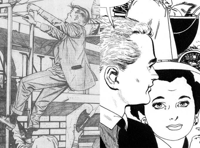
Alex Toth possessed a skill to match his temperment - always striving to improve - never, it seems, content.


Yet in all his work, an attention to storytelling economy and detail only where necessary.


Details we seldom got to see because his pencils are so rarely available.


His inkers - seldom his partners, inked per their own style - with no fault suggested. His own work in ink fitted his desired finish, often it seems, in a mind to complete the work through experimentation.

His style in this Rip Hunter...!
TOTH...!

5/02/2016

Manning Mondays

What can I say, but that I like me some Russ manning art.


Deceptively simple in design and line. Yet complex in composition and detail.

Luana.
He did it all with an economy of style. What he didn't draw is the secret of masters.


4/29/2016

Earl Norem

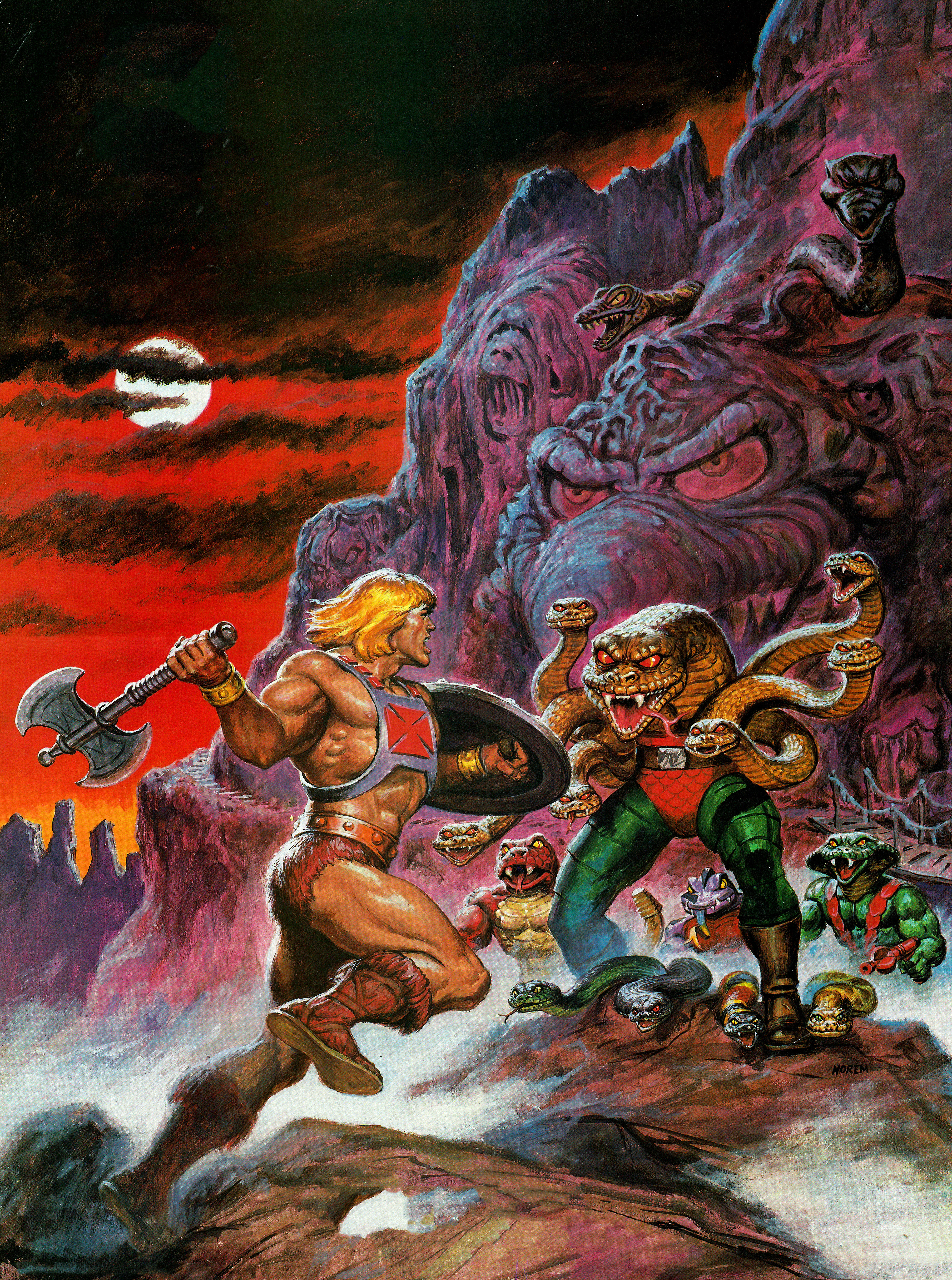
My first encounters with the man who we came to know by the name NOREM, began with He-Man. He really captured the menacing atmosphere of Eternia, and for kids, it set the tone for the games to play with the some of the coolest action figures of the time.

Master of the Paints!
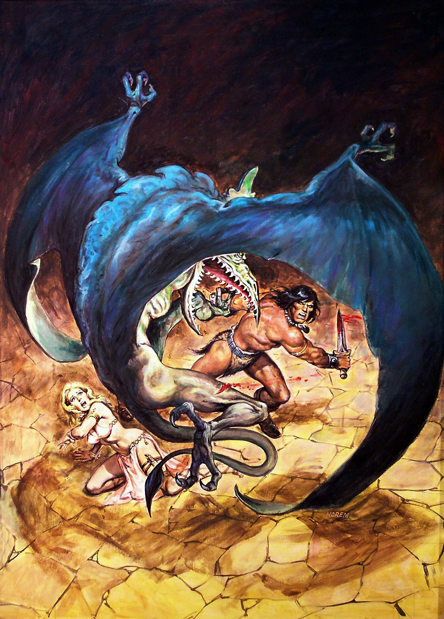
It was later that I began to see his work on the covers of the Conan magazines Marvel distributed on the newstand. He really captured the feel of Conan too, with some great covers!

Conan!
You'll have to search Earl Norem for some of his other great work - like that for mens magazines. Plenty NSFW. All great stuff.

4/22/2016

DeZuniga Art!

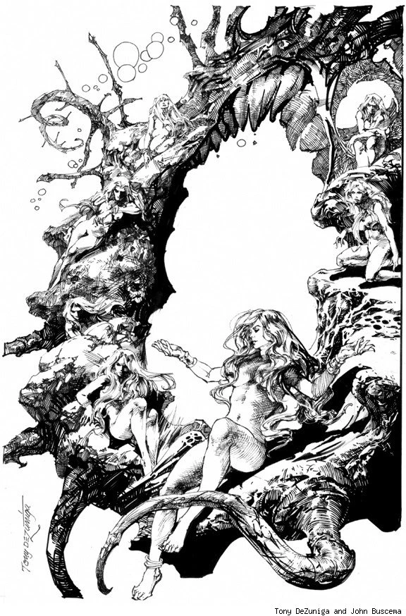
Tony DeZuniga, a gentleman artist.

Star Wars!
DeZuniga mastered the art of pen and ink. Sure, we in comics call it "inking"...


...and here he is over the great John Buscema, yet his skill with a pencil needed no inking.

4/29/2014

Toth

His economy of line, placement of blacks, his sense of design. These are things easily discernible with the eye. Toth's art is bold and for some, "too simple". That's the deceptively obvious misconception of his work. It is not simple. Only through much thought given to composition and layout (and experience), did Toth arrive at pages of such clarity. He COULD have added more line-work - hatching, stippling (which he often did) and the like - but why, when he could define more with one line than three or four.


Many a master illustrator - Toth's peers in time period and creative mastery - advocated the same approach. Every line must have a meaning. Even if simply decorative, they were placed with PURPOSE. As an accent to another line or shape, or to define the same. Question: when does a line become a shape? Toth knew. The shapes created by his placements of black unified a picture's compositional balance, while strengthening its impact.


Often, there was no delicacy of line - he'd ink with a marker and wasn't really bothered with technique in that regard. For each job, consideration of line and rendering of what textures he choose to include, always came back to his rule - Keep It Simple.


This simplicity led Toth to the animation industry, crafting countless model sheets and storyboards - most well known being Space Ghost and the various Super Friends cartoons.


It was his exposure to these working methods that further evolved his art. His brief forays back to comics in the 1970s and 80s were very different from earlier work. This is to be expected, as the majority of artists always strive to improve their art and by nature of experience and time, the art changes.
A funny note, something to look for among some artists: with age and girth of illustrators, figures tend to increase in size. Stockier, thicker figure drawings become common. While this is true of many artists, it doesn't appear in the work of Gil Kane - the figures of his final two decades remained the same proportion (and so did he). Yet look at Kane's style evolution from the 1960s through 1970s (that's surely a post to come).


Toth's most hidden work to many today, are his many stories told at Dell. Dell Four Color and a title or two like Disney's Zorro. Besides some fabulous work for DC on House of Mystery and romance comics, his far more detailed work was found in warren's Creepy/Eerie - some of his final 'full' comic work.


And come to think of it, you don't really read much about Toth's women---


Toth could draw some hot ladies!


4/22/2014

Toth Tuesdays


The Shadow knows...

1/16/2014

Mark of Kane

The Green Lantern Corps - that was my introduction to Gil Kane, one of the most influential artists upon my work and long interest in comics. John Romita JR and a particular issue of Amazing Spider-Man, being another.
Yes, it really was good enough to steal.

Back to the Lanterns.
The Corps comic series of pre-Crisis DC, led to many years of hunting for Kane's 'barbarian' tale in Sword of the Atom. Only recently, with the widening and shrinking of the world via the internet, did collections and examples of Star Hawks and his Tarzan Sundays, become available.

Savage and Black Mark too, although original editions found their way here.


But Green Lantern and the Atom is where he did the majority of his better known work, as well as numerous Marvel covers...


... And work on the infamous Thunder Agents with the legendary Wally Wood.
Some of his best work from that period, was the hybrid hero, Captain Action. Kane's pages, storytelling and figures marked the style by which he'd be known for, from that point until his death.


Muscles, foreshortening, head montages, and poses that were so recognizably Kane.
His design for boots is pretty much etched in the mind, burned into memory.
Boots


His work on Tarzan, exposure to and meeting with Burne Hogarth, and the multitude of Marvel covers, were a melting pot - birthing skills and techniques that would stay with him and be refined.

Depth, deep foreshortening, his unique and constant use of perspective were also hallmarks of his work.

It can be seen in his personal work - Savage, a pioneering graphic novel. The narrative text style aside, the structure of the work, the composition and draftsmanship in each panel, continued from that book. Before then, his DC work closely followed the house style. His art comparable to those who inked and worked alongside him - Carmen Infantino, Murphy Anderson and others. Excellent art, but not as dramatic and not with such a deep sense of scope. In cinema, Kane's later art would be described as "angle with angle" shots; meaning it always included two surfaces (sides) of any object in the image, with a low (or high) camera angle in relation to it.

It was this that cemented Kane's distinctiveness.

Next: part 2.