Russ Manning is not a name you hear very much of today, but he is associated with quite a famous character - Tarzan.

From 1965 to 1972 Manning was the daily and Sunday newspaper strip artist for Tarzan. Leaving the daily strip in 1972, he continued to work on the Tarzan Sunday Pages and Tarzan stories for the European market. In both can be found some of his greatest work. He also worked for Dell, producing Tarzan comics and it was there, through Western - Gold Key, that his own creation was born.
Magnus Robot Fighter! Magnus was a hero in the mold of Doc Savage - intelligent, tough, and direct, even "savage" in his own right. Many have very accurately described Magnus as Manning's technological Tarzan - their character was very much alike.
Manning also produced work on a wide variety of stories at Dell, which is some of his earliest work.
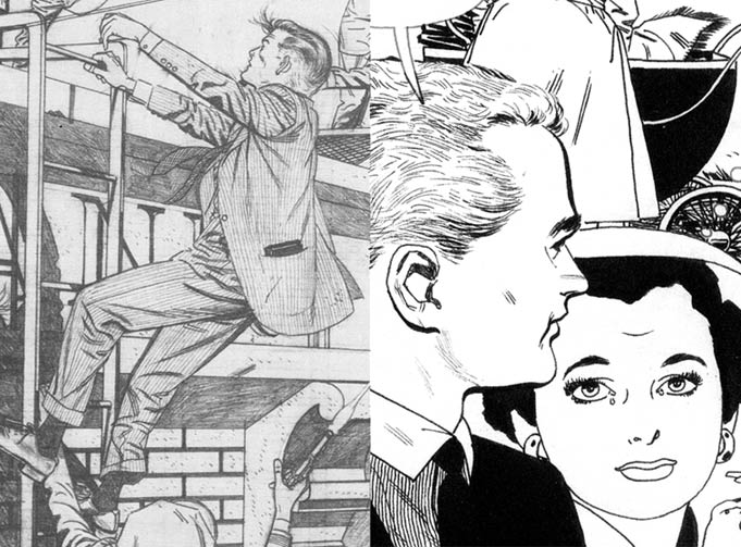
However, his excellent draftsmanship was all in place. The later work merely shows a greater confidence in figure poses - learned no doubt by his work on the Tarzan dailies. Practice makes perfect.
Magnus came to greater fame, to an all new generation thanks to Valiant Comics. Later, Manning's work was reprinted as was his rare Johner and the Aliens. Today, Dark Horse releases impressive hard covers of Magnus, with Manning's great art on display.
Considering the period in which he worked, it is not difficult to think of Manning at DC or Marvel. While his art better suited the DC house style, what about Marvel? Easily able to delineate any of DC's sci-fi books of the time, or contribute to Showcase or Brave and the Bold, on titles like The Metal Men, what about Manning at Marvel? On what character?
Marvel in the 1960s, was just being created - or at least all of the characters we associate with Marvel, and a few
key artists were responsible. Considering the content of Magnus Robot Fighter, the obvious hero for Russ Manning, would have been Iron Man. Artists Don Heck and Jack Kirby established Shell Head in Tales of Suspense. Heck drew through issue 72 of 1965, with Steve Ditko penning the intro of the red and gold armor. Gene Colan followed Heck, penciling a memorable run, one that many consider as defining the character for the so-called Bronze Age. What if Colan had remained on Daredevil? Or Daredevil and Captain America, and Manning had illustrated Iron Man? What if?
Of course, we could consider the limitless possibilities of Manning at DC. Myster in Space, Strange Adventures? Maybe the Legion (although he never drew anything approaching a team book), and of course, the Metal Men, because of his work on Magnus. He 'did' come to DC, when DC took over the Tarzan license and reprinted Manning's work, but he never penned any of the DC characters he could have drawn so well.
Whatever the case, the goal of many a cartoonist was to draw for the newspapers, and Manning did this with great skill on Tarzan. He worked on his own creation in comics and perhaps his work was stronger for having done both.
Sadly, Manning died in 1981, and he did not come to prominence as perhaps he would, as comic fandom continued to mature. Today, we see an often heavy-handed and very detailed comic page. Yet Manning, through all his work detailed more with less and with clean, crisp line-work, told stories with great economy of art. His jungles abounded and still, when studying the images, much was done through silhouette - often outline with fill-color and shadow. A few well-placed and simply rendered leaves and or branches and vines held it all together. All in service of the characters and plot. Usually framing the key characters and providing a beautiful 'stage' upon which grand stories were told.





 Posts
Posts

