Wanted to start a Friday post series, and to talk about Frank Robbins - so off we go!
Along with Milton Caniff, Frank defined this style, both having worked with the incredible Noel Sickles, their style is refined (?) from early ink drawings of the master illustrator Harold Von Schmidt.
Robbins began his Johnny Hazard series at the end of WW2, and what a fun run it was!
Alex Toth loved (and hated) his work. There was a point at which Toth felt Robbins had lost something, and when exactly that might be is up to debate. Robbin's style in the 1970s differed vastly from his early work, but then, everyone's art evolves.
He was one of the masters of light and shadow, design and compostion. He placed large ink areas into the art with absolute confidence and grace.
Color on the strip was primitive as was a consequence of the time, technology and media, and yet, it works. A single image often held so much, but not in a cluttered way.
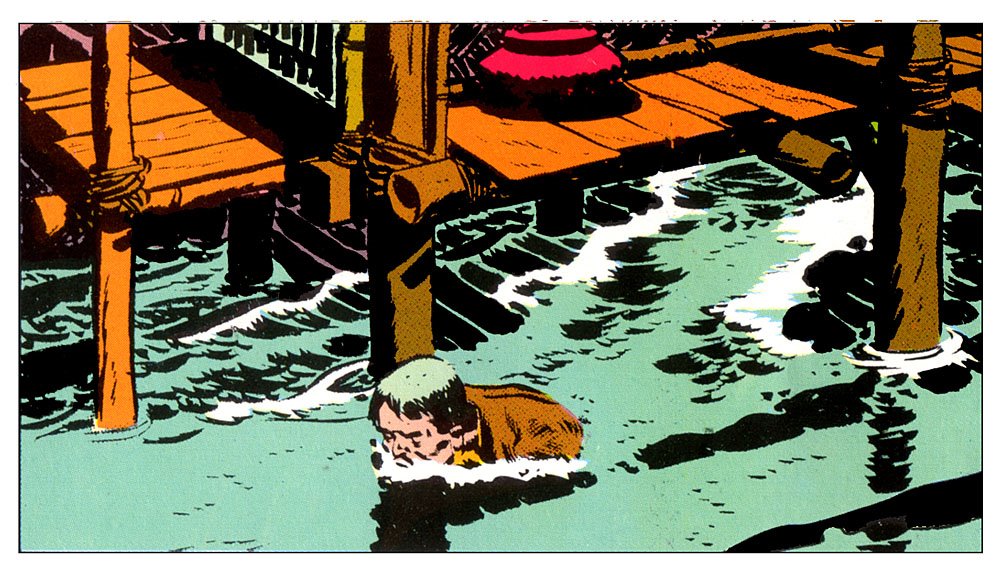
Many are the discussions on the difficulty of depicting water, and variety of style to do so. Robbins knew how.
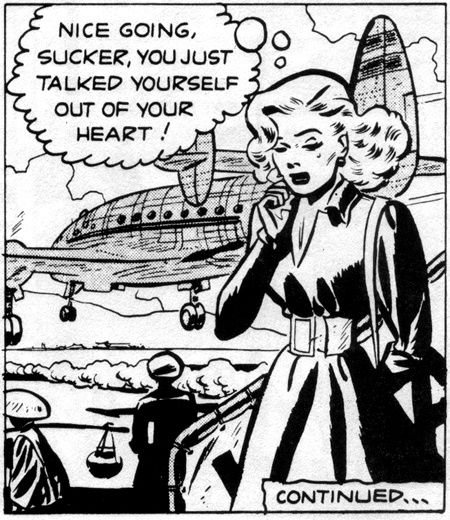
Hazard was an adventure strip at its best, with all the feel of men's adventure and the pulps, and a touch of what makes Indian Jones so fun.
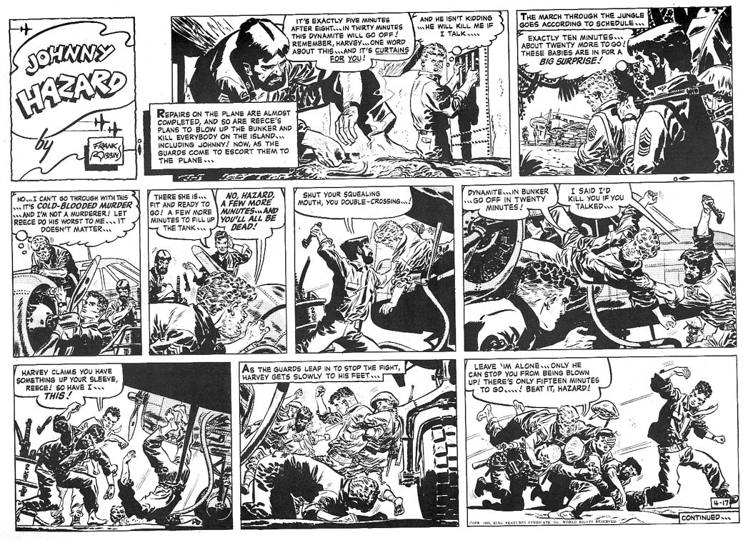
Robbins!
Showing posts with label Lettering. Show all posts
5/27/2016
9/01/2015
Gaspar!
Gaspar Saladino is a letterer's letterer. While hand-lettering has largely been replaced by digital fonts, Gaspar has long been one of the best in the business - both on covers and interiors,
His interior work gained him the confidence of Carmen Infantino for DC Comics, and out of the inside pages onto the covers. Both his cover-copy and ad copy lettering brought excitement to the DC line. His letters were works of art, inked and crafted with great variety. From title lettering to sound effects, Gaspar made an impact.
With bold, clear lettering and freehand balloons, Gaspar made the dialogue clear, while remaining "invisible". Where he WAS visible, it mattered - the advertisements - classic DC half and quarter page ads showcasing the greatness of the house titles.
Along with cover art, Gaspar's lettering spoke to readers and sold comics.
2/09/2014
1/10/2014
Frank Robbins
Robbins' art is at once cartoon and complex. He was a master of shadow as handed along from Sickles and Caniff, and further honed by a true master. Studied and chastised by Toth, Robbins crafted the Hazard strip for 30 years.
And what a lettering deftness as well.
![]() |
| The complexity of light and shadow. |
![]() |
| Crafting shadow shape dynamics. |
Labels:
A First Salvo,
Action,
Adventure,
Art,
Comics,
Frank Robbins,
Illustration,
Lettering,
TOTH
Subscribe to:
Posts (Atom)


