Welcome.

@afirstsalvo

Also follow us on Instagram for regular art posts.

#afirstsalvo


Showing posts with label Illustration. Show all posts

5/27/2016

Frank Robbins Fridays!

Wanted to start a Friday post series, and to talk about Frank Robbins - so off we go!


Along with Milton Caniff, Frank defined this style, both having worked with the incredible Noel Sickles, their style is refined (?) from early ink drawings of the master illustrator Harold Von Schmidt.

Robbins began his Johnny Hazard series at the end of WW2, and what a fun run it was!


Alex Toth loved (and hated) his work. There was a point at which Toth felt Robbins had lost something, and when exactly that might be is up to debate. Robbin's style in the 1970s differed vastly from his early work, but then, everyone's art evolves.


He was one of the masters of light and shadow, design and compostion. He placed large ink areas into the art with absolute confidence and grace.


Color on the strip was primitive as was a consequence of the time, technology and media, and yet, it works. A single image often held so much, but not in a cluttered way.

Many are the discussions on the difficulty of depicting water, and variety of style to do so. Robbins knew how.


Hazard was an adventure strip at its best, with all the feel of men's adventure and the pulps, and a touch of what makes Indian Jones so fun.


Robbins!

4/29/2016

Earl Norem

My first encounters with the man who we came to know by the name NOREM, began with He-Man. He really captured the menacing atmosphere of Eternia, and for kids, it set the tone for the games to play with the some of the coolest action figures of the time.

Master of the Paints!
It was later that I began to see his work on the covers of the Conan magazines Marvel distributed on the newstand. He really captured the feel of Conan too, with some great covers!

Conan!
You'll have to search Earl Norem for some of his other great work - like that for mens magazines. Plenty NSFW. All great stuff.

4/22/2016

DeZuniga Art!

Tony DeZuniga, a gentleman artist.

Star Wars!
DeZuniga mastered the art of pen and ink. Sure, we in comics call it "inking"...


...and here he is over the great John Buscema, yet his skill with a pencil needed no inking.

4/29/2014

Toth

His economy of line, placement of blacks, his sense of design. These are things easily discernible with the eye. Toth's art is bold and for some, "too simple". That's the deceptively obvious misconception of his work. It is not simple. Only through much thought given to composition and layout (and experience), did Toth arrive at pages of such clarity. He COULD have added more line-work - hatching, stippling (which he often did) and the like - but why, when he could define more with one line than three or four.


Many a master illustrator - Toth's peers in time period and creative mastery - advocated the same approach. Every line must have a meaning. Even if simply decorative, they were placed with PURPOSE. As an accent to another line or shape, or to define the same. Question: when does a line become a shape? Toth knew. The shapes created by his placements of black unified a picture's compositional balance, while strengthening its impact.


Often, there was no delicacy of line - he'd ink with a marker and wasn't really bothered with technique in that regard. For each job, consideration of line and rendering of what textures he choose to include, always came back to his rule - Keep It Simple.


This simplicity led Toth to the animation industry, crafting countless model sheets and storyboards - most well known being Space Ghost and the various Super Friends cartoons.


It was his exposure to these working methods that further evolved his art. His brief forays back to comics in the 1970s and 80s were very different from earlier work. This is to be expected, as the majority of artists always strive to improve their art and by nature of experience and time, the art changes.
A funny note, something to look for among some artists: with age and girth of illustrators, figures tend to increase in size. Stockier, thicker figure drawings become common. While this is true of many artists, it doesn't appear in the work of Gil Kane - the figures of his final two decades remained the same proportion (and so did he). Yet look at Kane's style evolution from the 1960s through 1970s (that's surely a post to come).


Toth's most hidden work to many today, are his many stories told at Dell. Dell Four Color and a title or two like Disney's Zorro. Besides some fabulous work for DC on House of Mystery and romance comics, his far more detailed work was found in warren's Creepy/Eerie - some of his final 'full' comic work.


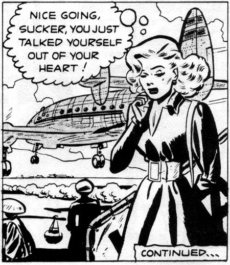
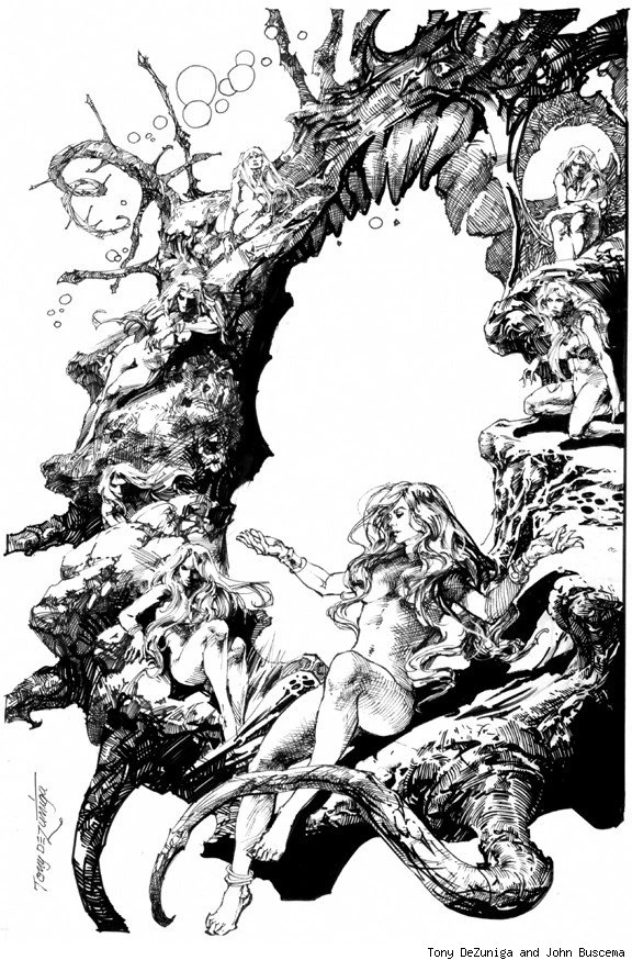
And come to think of it, you don't really read much about Toth's women---


Toth could draw some hot ladies!


2/23/2014

2/09/2014

The Sundays

Stan Drake.


Try it...


1/20/2014

Manning Mondays

Star Wars...


Russ Manning illustrated the first Star Wars strip and comics were better for it.

1/15/2014

A Williamson Wednesday

Al Williamson...
Williamson, Krenkel, Frazetta


1/13/2014

Manning Mondays


A seamless, beautiful re-purposing of art...


Check out Russ' collected work...